|
Graphing Motion
Let's
say that we wish to travel from point A to point B and back again
along a walkway that has installed on it a convenient number
line. While we are moving, an associate will note where we are
at the end of each second. We can record and display our results
in a table; this may help organize the data into a form that
might lead to deeper understanding
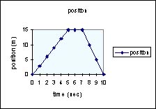
Sample data and corresponding graph.
 |
|
pos |
0 |
3 |
6 |
9 |
12 |
15 |
15 |
15 |
10 |
5 |
0 |
|
time |
0 |
1 |
2 |
3 |
4 |
5 |
6 |
7 |
8 |
9 |
10 |
|
.Our data taker makes the following
observations. We are at the starting place at time t = 0. We
dash to point B 15 m distant, arriving at our destination at
the end of 5 seconds; we then stop to rest (our position does
not change) for two more seconds; finally, we race back to arrive
at our starting place at the end of the tenth second. A position
versus time graph is shown in the box. If that is all there was
to graphing, it would not be exciting and would not be included
here.
Let's look more closely at what the graph may be hiding. Let's
consider the slope
of the curve. Remember that slope is
defined as change in vertical coordinate (rise) over the change
in horizontal coordinate (run). That means for this graph the
slope = rise/ run = change in position divided by the elapsed
time. But this is the definition for velocity. In the graph
above, for the interval 0-5sec the slope is positive and constant.
That means our velocity is positive (pointing to the right by
our sign convention). From t = 5 sec to t = 7 sec, the change
in position is zero.Therefore, were are not moving. Finally,
from t = 7 sec to t = 10 sec our position returns to zero. The
slope is negative and larger in absolute value than the slope
for the first 5 sec.
Velocity vs time graph for event #1.
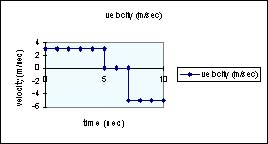 |
A sketch of a velocity vs. time
graph looks like the box at left. For simplicity sake we are
assuming that the transitions from one speed to another occur
in virtually no elapsed time. |
See also
THis is a applet that plots position v time, velocity v time,
and acceleraion v time
http://www.walter-fendt.de/ph14e/
Velocity vs time - Event #2
 |
If we graph velocity as a function
of time, we get the curve at left. Look at the slope of this
graph. It is negative and constant. The slope of a velocity vs.
time graph yields acceleration. |
Event #2 acceleration vs time
 |
At left is a graph of acceleration
as a function of time. You will note that the curve is horizontal
and stuck on -9.8 m/s^2. This is the expected value for the acceleration
of any free-falling object. |
Now consider a new event that is closely
related to the last event. Let us assume that a perfect super
ball ( a ball that loses no energy upon collision with the ground)
falls from rest from a high place, strikes the ground and rebounds
precisely to its starting place. What would the graphs look like
now?
Event #3 position vs time
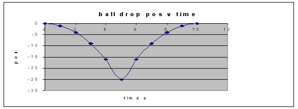 |
At left is the position vs. time
graph. notice the very abrupt change in the direction of the
curve at about 5 seconds. |
Event 3 - velocity vs time
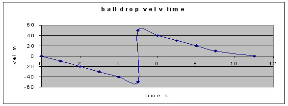 |
Now comes the velocity vs. time graph.
Look at what happens to the velocity at 5 seconds. At one moment,
the velocity was -50m/s; a moment later, +50 m/sec. The connecting
piece is steep but it is not vertical. |
Questions
1. For the bouncing ball situation,
what would the graphs look like if the ball bounced a second
time? Look at the middle parts of these graphs. Ever seen anything
like these before?
2. Consider this situation: We toss
a ball into the air. Before gravity can stop it, the ball hits
the ceiling. Sketch the graphs.
Return
to kinematics
This page last edited 01/23/09.

|